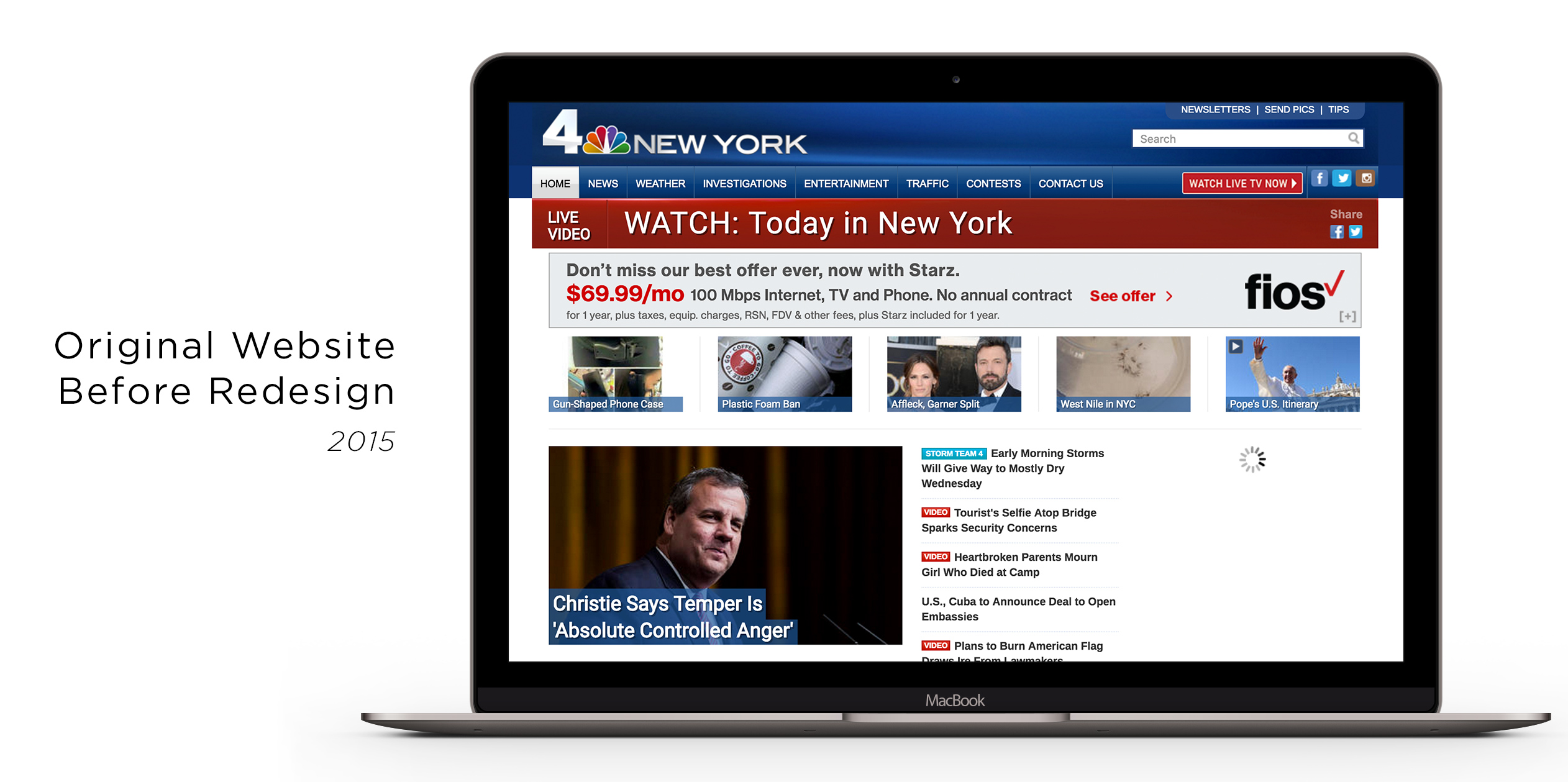
In the summer of July 2015, discussions came about to redesign the homepage and various other elements of the desktop and mobile versions of the local NBC television station websites. This was to update the look to the new broadcast brand (internally called LOOK-N) launching the following year, as well as improving usability and news delivery. The broadcast portion of NBC Local news reaches over 64.7 million Americans in the country. That's huge exposure, and we needed to make sure that the new pages complimented the broadcast and brought a deeper understanding of the news we were delivering digitally.
Challenges & Goals
NBC Owned Television Stations has 26 markets (11 NBC and 15 Telemundo stations) that have their own needs and goals. We had to create one flexible design that would fit the majority of their needs but also improve the user experience. We were also aiming to tie it to a broadcast rebrand so we could only focus on the homepage and global navigation elements, not every single internal page.
Key Goals:
- Needed to improve the headline density on the page without cluttering the layout
- Social Media such as Tweets and Facebook posts needed to be prominently displayed on the homepage as well so that users could not only get the latest headlines but also breaking local information.
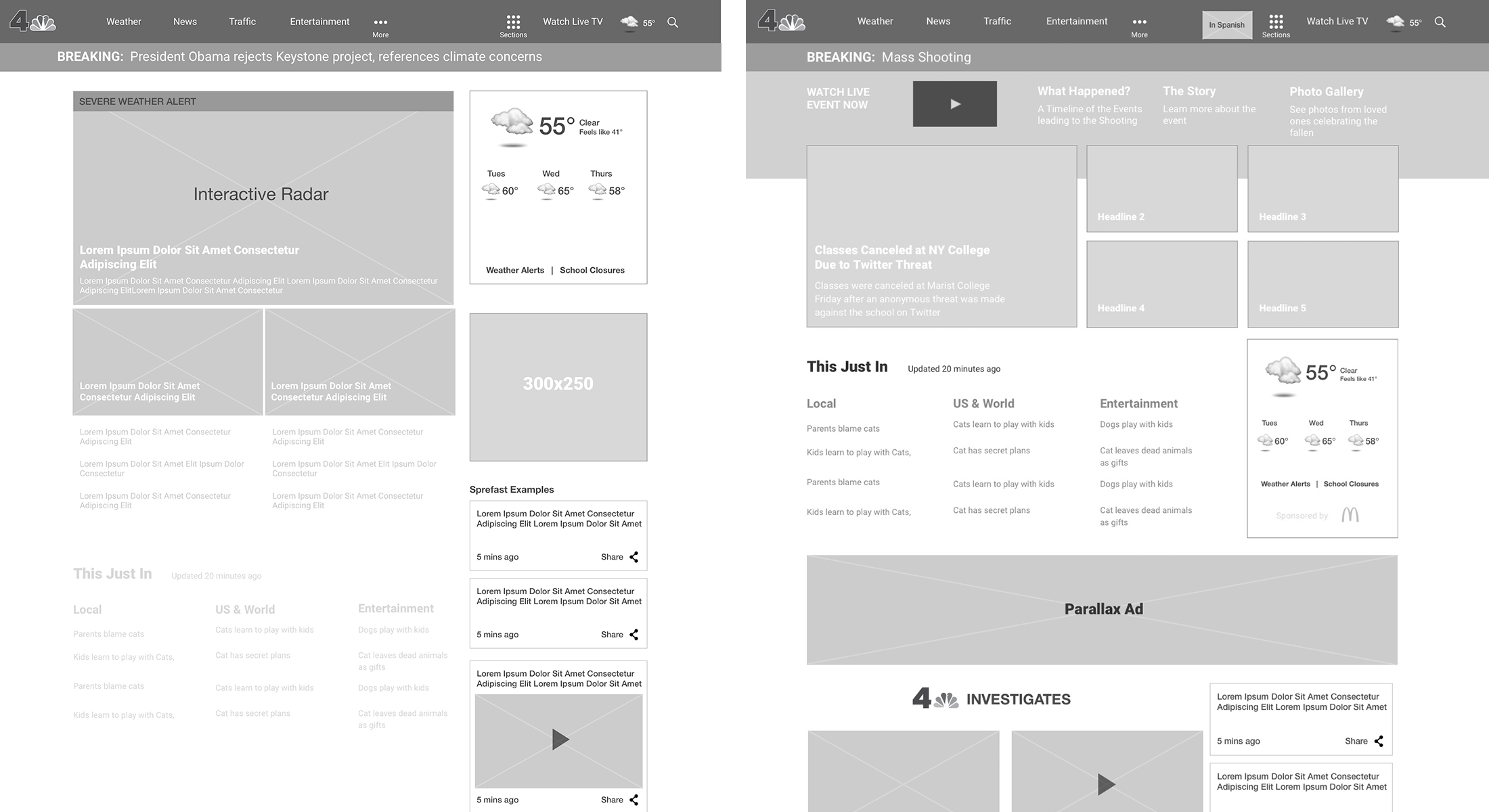
- Weather information, highlighting radar technology and severe weather situations, needed to be front and center.
- Work within the limitations of a legacy content management system, using modules and content types that existed in the previous design of the website.
- It could not be image centric like magazine websites or national news outlets because our photography content was not always the best (murders, arrests, etc) and we needed to stick to a 16x9 photo layout.
Approach
We looked at the biggest asks from the most vocal markets and then worked from there. We spoke with stakeholders representing the interests of the broadcast stations and took into account what they needed. Wireframes were drawn up focusing on features and from there iterations and features were created.
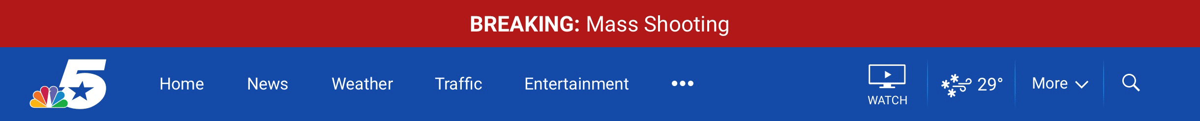
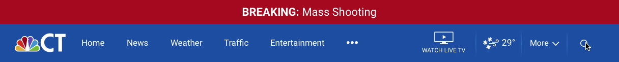
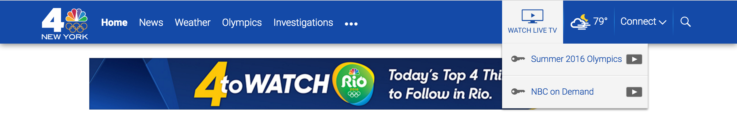
We improved headline density by compressing the header navigation bar and putting non-essential elements into drop-down menus such as social media, newsletter sign ups, and blogs. Then we made sure the header stayed fixed so that the user could access all the information they needed. We also convinced the stations to reduce their brand logos to a standard width so that we could fit more navigation items. This was no easy task as you can see below.
Though these are simple, common design solutions for most websites, this was a big deal for the OTS sites because of how long the last refresh had been. Even search, which used to have a large text input box, was simplified to a beautiful interaction where the user clicks on the Search icon and the text input field shifts over the navigation items to the left, placing the close button directly under their cursor.
From Broadcast to Digital
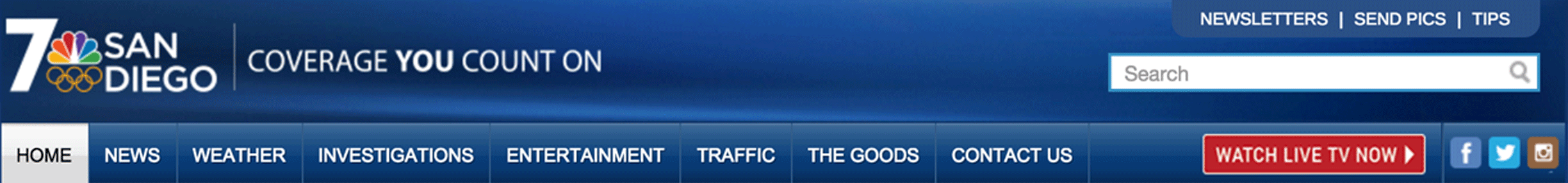
From the beginning we knew the biggest visual changes we were going to make. Traditionally the website incorporated broadcast style graphics such 3D gradients and iconography, but we wanted to make sure this new design felt like a modern digital experience. We proposed a flatter and cleaner color palette that built on the new color branding that LOOK-N would use. Flatter weather icons were already designed for the LOOK-N broadcast, so we incorporated them into the project. In our proposals to stakeholders we also explained the amount of space their large, broadcast-style logos were taking in the navigation. Through that we were able to pair down things.
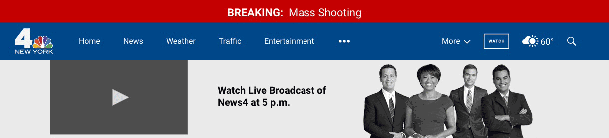
Breaking News & Live Streaming

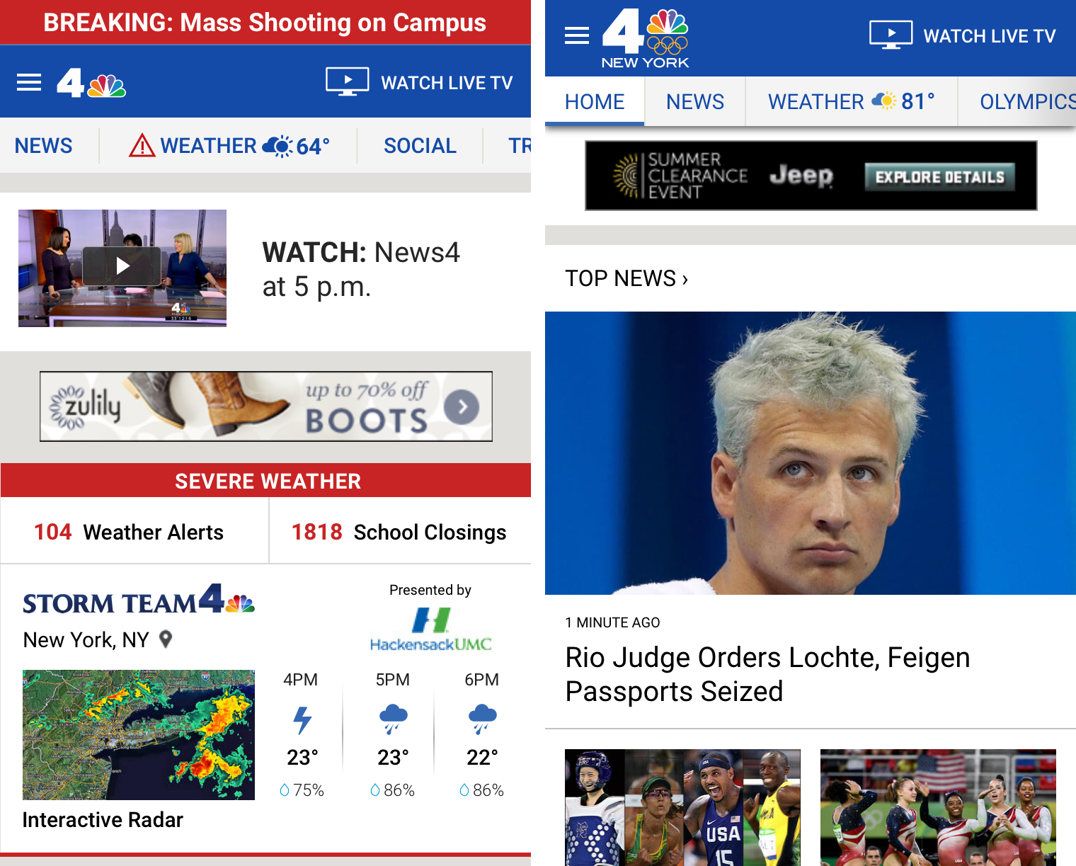
With the original website design, breaking news and live streaming were treated the same and they would take up space in a red "breaking bar" that was placed underneath the websites main navigation. NBC OTS had several bars, a regular breaking bar for news, a double breaking bar which had a link to a live stream and picture, and various off-shoots.
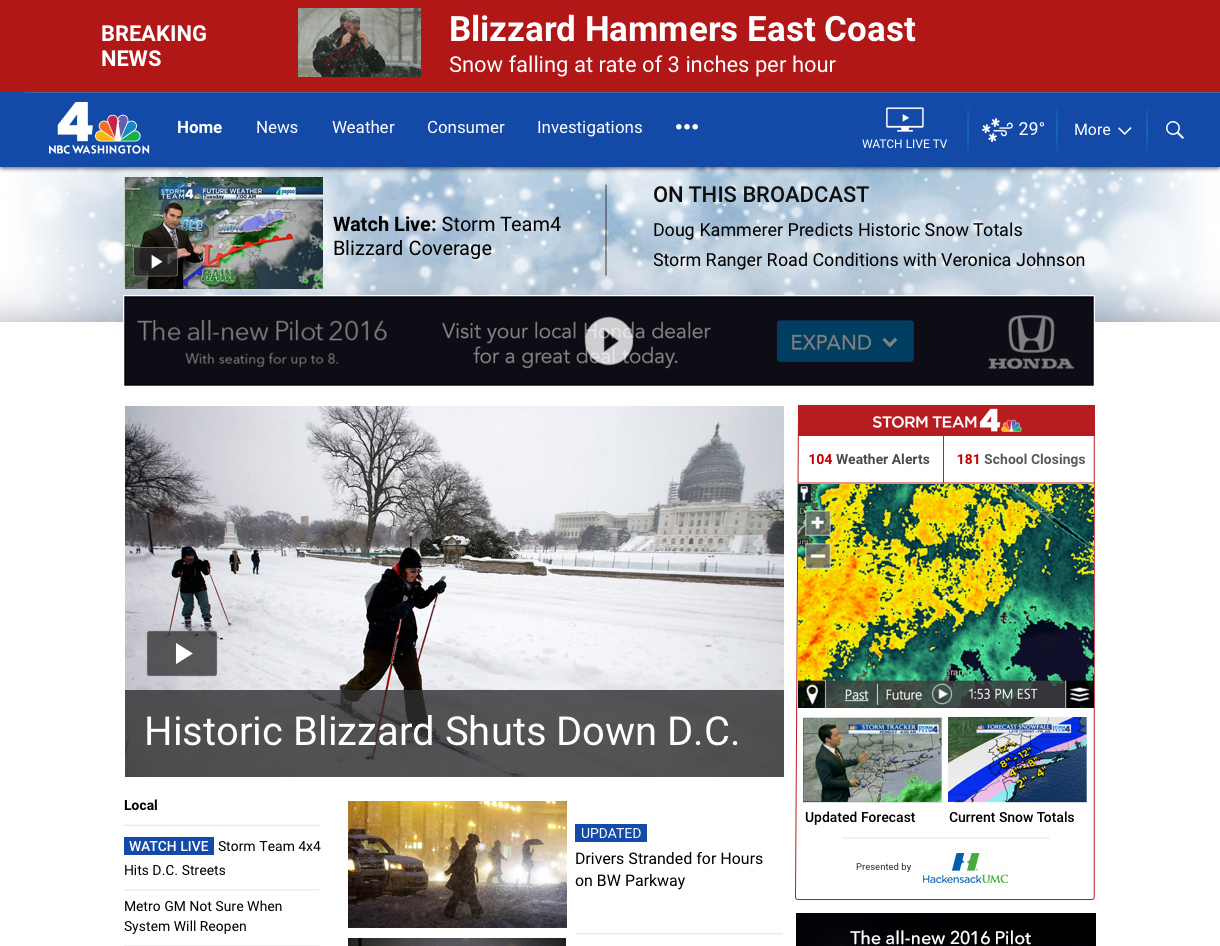
We simplified this by introducing a main Breaking bar that sits above all the content and has the option to include an even bigger headline and picture for the editorial team. Live streaming was moved to a new feature called the Live Context bar which only appears during a live stream or broadcast event. The goal was to tie the On Air Broadcast to the digital property and give Broadcast viewers deeper context on the stories they were seeing.
When active, it highlights 2-3 headlines from the broadcast and it also includes a link to the stream itself. During severe weather events the Live Context bar changes the background to fit the weather type (thunderstorm, tornado, blizzard, rain, etc).
Severe Weather
We knew that weather and radar were the most important things we needed to focus on so we created a second homepage template that made the first news article substantially larger for emphasis during Severe Weather events. When there's a live broadcast or stream this ties in perfectly with our Live Context bar and the radar that sits to the right of the main content well.
Social Media
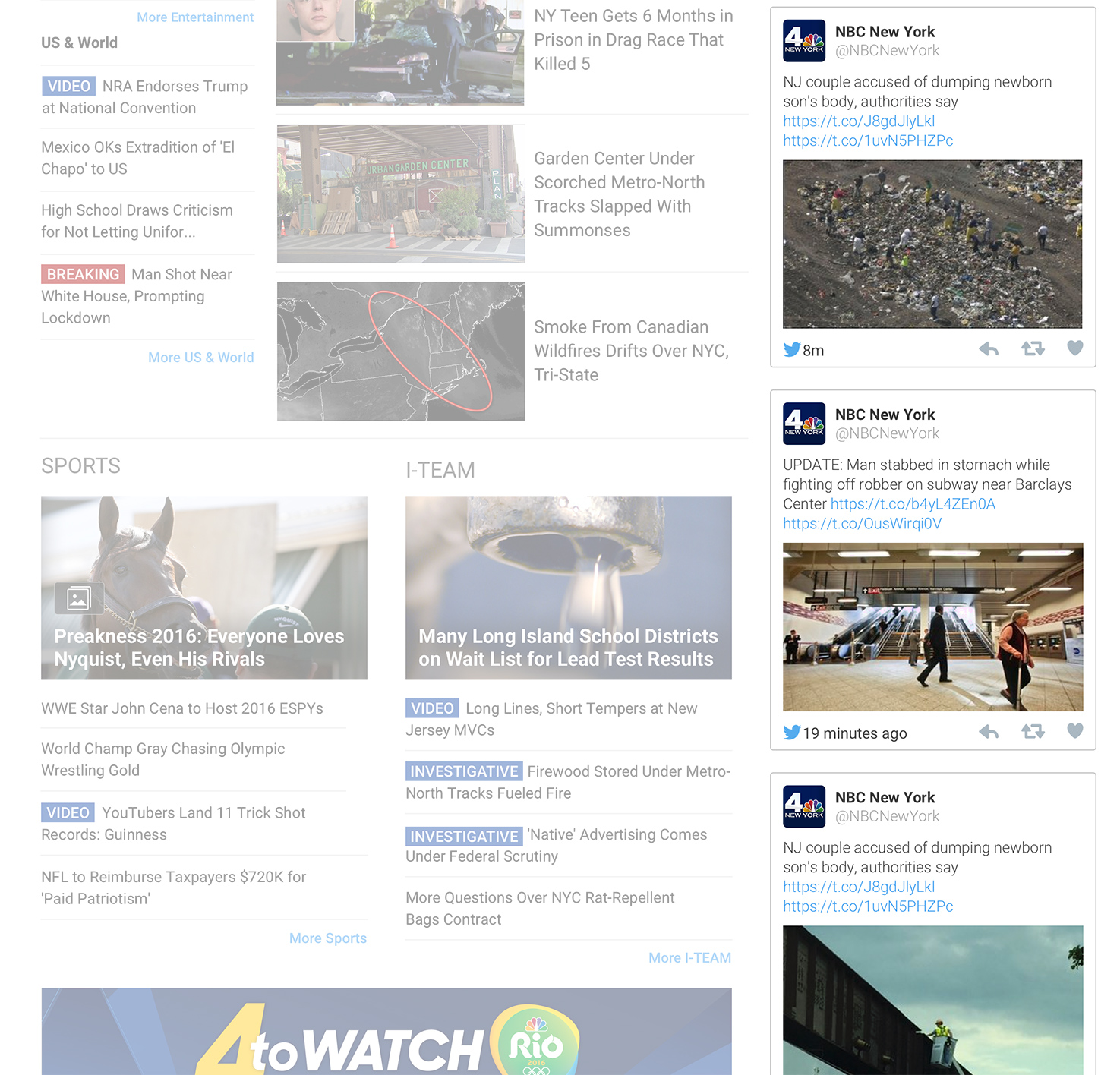
For social media we decided to integrate Spredfast to pull in Tweets, Facebook Posts, breaking alerts, and more into the right content well. It updates automatically every few minutes and users are shown a "New Updates" button so that they can initiate a refresh if they so wish.
Television Everywhere
Another key goal was to make accessing Television Everywhere, or TVE, content much easier. In the old website there was a button that directed the user to "Watch Live TV" and it was a clunky experience. We moved that button into a top-level menu item that provides a drop down with the current live On Air Broadcast programming specific to the market. For example if you're in New York you would see Jimmy Fallon, but San Diego would not see this option until later.
Content locked behind "Cable credential" systems have a key icon. We were very passionate about including this because we ourselves disliked being given the option to see something and then being told it was unavailable.
Tying Mobile & Desktop Experiences
The biggest challenge was to make sure that the new features were available cross-platform. As I mentioned before, this was not a responsive design so we had to work within an existing template-based CMS that served a mobile version and desktop version depending on what device the user visited on.
Instead of shoving the most important information into a Hamburger menu, we decided that a Quicklinks nav bar which the user could scroll through would have a higher impact on navigation on a mobile device. Through testing our design team found that users never clicked on the isolated weather icon on the mobile version, so we moved the current conditions icon next to the Weather menu item.
Conclusion
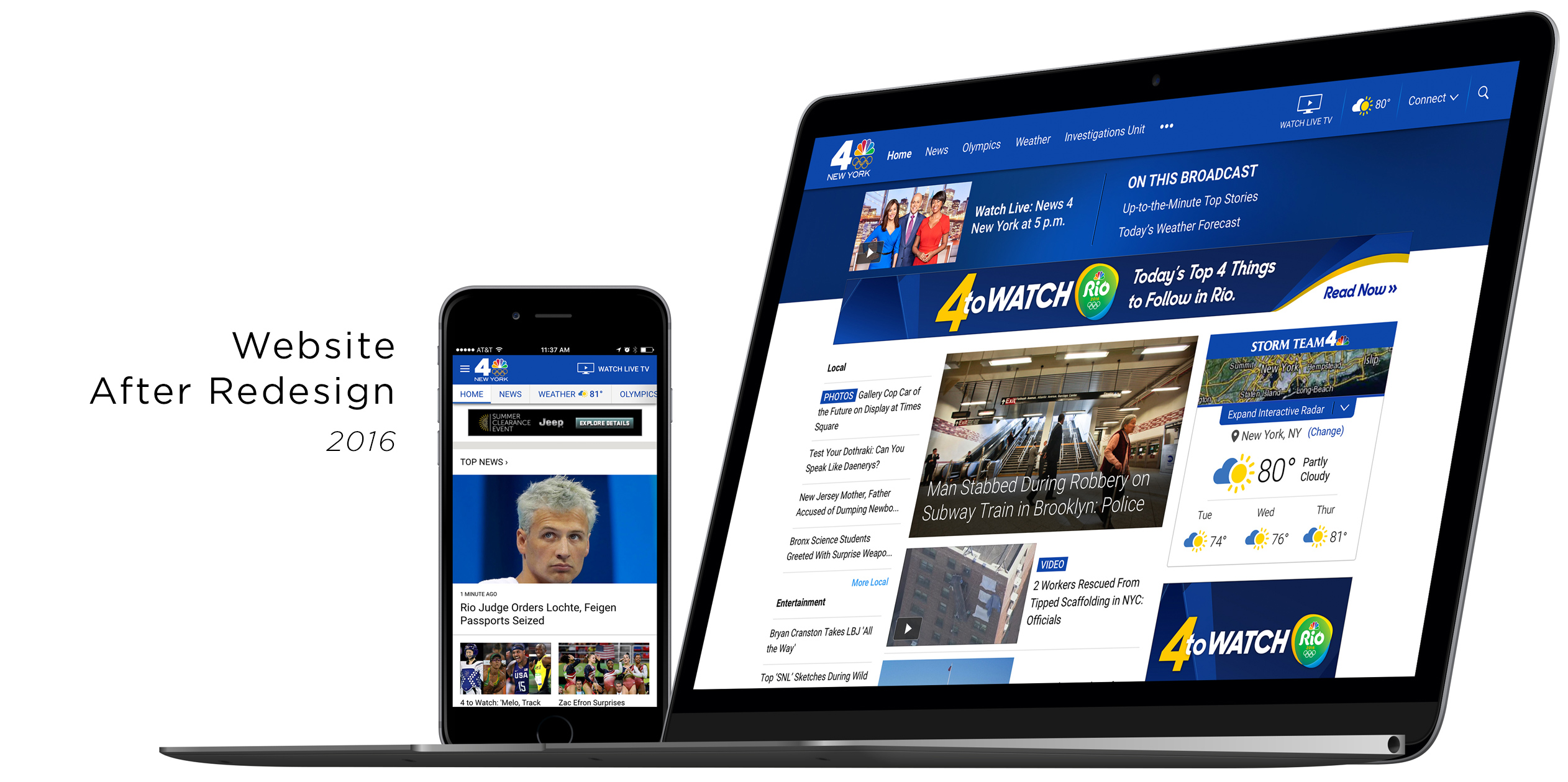
In the end the project resulted in 11 revamped local homepages for NBC, with Telemundo following suit next year. We wanted to redesign the entire website from the ground up using a responsive, cross-platform design, but due to business goals and tying the redesign to the broadcast re-brand we had a tighter time-frame.
Because the site launched recently, we do not have enough data to compare this version with the old one. However with what we've seen already there is an increase in interactivity with the navigation and Top News items.
Managing expectations across so many markets and stakeholders was a true challenge, but we created a design and experience that works for everyone, met the goals we aimed for from the beginning, and introduced new concepts such as the Live Context bar and Weather in the mobile navigation.
No comments.